Creating a website is more than just adding images and text. Every design choice influences how visitors interact with your site. Two of the most powerful elements in web design are color and typography, and understanding how they influence visitors can significantly enhance your online presence. For businesses working with a web designer, knowing the role of these elements can make a tangible difference in user engagement and conversions.
Understanding Typography and Its Role
Typography affects user experience in ways that go beyond aesthetics. The fonts you choose, their size, spacing, and weight can influence readability, comprehension, and overall perception of your brand. Poor typography can make content hard to read, reduce trust, and increase bounce rates.
Importance of Font Selection
The typeface sets the tone for your website. Serif fonts, for example, are often seen as formal and trustworthy, while sans-serif fonts feel modern and approachable. Selecting the right font combination can guide visitors’ emotions and encourage them to take action.
- Readability: Choosing fonts that are clear and legible across devices ensures visitors stay engaged.
- Hierarchy: Font size and weight help establish content hierarchy, making it easier for readers to scan and find important information.
- Consistency: Consistent typography creates a sense of professionalism and reliability, which enhances user experience in web design.
A web designer in Dubai knows the nuances of font pairing and hierarchy to ensure that content not only looks good but reads well.
Font Size and Spacing
Even minor adjustments in font size, line height, and letter spacing can significantly impact readability. Crowded text can feel overwhelming, while text that is too spaced out may appear disconnected. Maintaining optimal spacing ensures comfort and flow as visitors navigate your website.
- Body Text: Typically 16px to 18px is ideal for readability on screens.
- Headings: Clear distinction between headings and body text improves scanning and comprehension.
- Line Height: 1.5x line height for body text improves reading ease.
What’s new With: Craft Design Technology—Why It Matters & How to Experience It
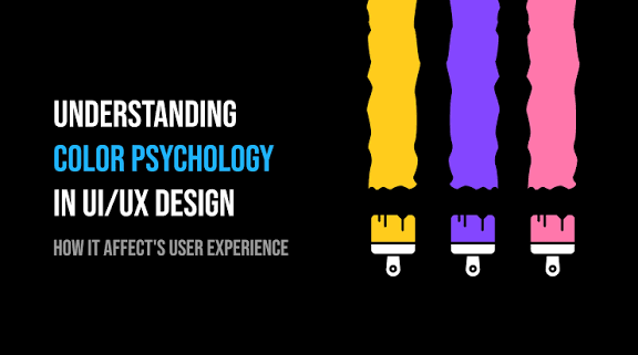
How Color Affect User Experience
Colors are more than just visual decoration. They carry psychological weight, influence perception, and guide actions. Understanding how color affect user experience is crucial for designing websites that engage and convert visitors.
Color Psychology
Different colors evoke different emotional responses. For example:
- Blue: Trust, professionalism, reliability
- Red: Urgency, excitement, attention
- Green: Growth, stability, calmness
- Orange/Yellow: Energy, friendliness, optimism
Using these associations strategically can guide visitors’ behaviour, influence purchasing decisions, and reinforce brand messaging.
Color Contrast and Readability
Colors need to contrast well to ensure readability. Low contrast between text and background can strain the eyes and reduce engagement. This is particularly important for users reading on mobile devices or in different lighting conditions.
- Text vs Background: Ensure high contrast for body text to maintain clarity.
- Call-to-Action Buttons: Bright, contrasting colors can draw attention to key actions.
- Highlighting Elements: Using accent colors can guide the visitor’s focus to important information.
Branding Through Color
Consistent use of brand colors strengthens recognition and trust. Whether it’s your primary color palette or secondary accents, careful planning ensures your website feels cohesive and professional. Web designing companies Dubai often emphasize branding to create a visual identity that resonates with the target audience.
Combining Typography and Color for Better UX
The interplay between typography and color can either enhance or hinder user experience in web design.
Readable Typography with Appropriate Colors
Text should always be readable first, attractive second. Light-colored text on a light background or complex fonts in bright colors can frustrate users. A web designer ensures that typography and color work together for clarity.
Hierarchy Through Font and Color
Use font size, weight, and color to establish hierarchy. Headings in bold or contrasting colors immediately draw attention, while body text remains neutral. This helps users navigate content efficiently and understand key messages at a glance.
Emotional Impact
Typography style combined with color creates an emotional tone. For instance, a modern sans-serif in dark blue conveys professionalism and stability, while a playful rounded font in orange can feel friendly and approachable. These subtle cues shape visitors’ perception of your brand.
Best Practices for Typography Affect User Experience
- Limit Font Families: Using too many fonts can look cluttered. Stick to 2–3 complementary fonts.
- Maintain Consistency: Keep headings, body text, and buttons consistent across pages.
- Prioritize Readability: Avoid overly decorative fonts for body text.
- Use Visual Hierarchy: Headings, subheadings, and paragraphs should guide the user naturally.
- Responsive Typography: Ensure fonts scale correctly on mobile devices for a consistent user experience in web design.
What’s new With: Top 5 Digital Marketing Agencies in Texas with SEO Services You Can Trust in 2025
Best Practices for Color Affect User Experience
- Maintain Contrast: High contrast ensures readability across all devices.
- Consistent Palette: Stick to a defined color palette for brand cohesion.
- Use Color to Guide Actions: Buttons, links, and highlights should use attention-grabbing colors.
- Consider Accessibility: Ensure color choices meet accessibility standards for color-blind users.
- Emotionally Appropriate Colors: Match color choices with the tone and goal of the content.
Case Studies and Examples
Example 1: E-Commerce Website
A website selling construction equipment used a bright red CTA button on a neutral background. Typography was clean and sans-serif. The result: a 25% increase in conversions because users could quickly identify actions and navigate the site easily.
Example 2: Professional Services Website
A Dubai-based consulting firm used a blue and white color palette with a serif font for headings. Users reported higher trust levels and longer session durations, highlighting the role of color affect user experience and typography in establishing credibility.
How Web Designing Companies Use These Principles
Professional web designing companies understand the importance of integrating typography and color with user behavior data. They conduct testing, observe heatmaps, and adjust designs to maximise engagement. By combining scientific insight with design expertise, these companies ensure that every visual choice contributes to a better user experience in web design.
Conclusion
Typography and color are fundamental to the way users perceive and interact with websites. From readability and clarity to emotional impact and brand consistency, these elements can make or break user experience in web design. Businesses working with a web designer can benefit from paying close attention to these details.
Invest in thoughtful typography and strategic color choices to ensure your website communicates professionalism, engages visitors, and converts them into clients. A carefully designed site isn’t just visually appealing—it’s a tool for growth.
Take Action: Partner with experts today to design a website where typography and color work together to enhance every aspect of your user experience in web design. Contact us now and start converting visitors into clients.
FAQs
- How does typography affect user experience on a website?
Typography affects user experience by influencing readability, comprehension, and the overall perception of your brand. Clear, well-structured fonts guide visitors through your content, making it easier for them to engage with your site. Poor typography can frustrate users and reduce the effectiveness of your user experience in web design.
- Can color really affect user experience on my website?
Yes. Color affects user experience by evoking emotions, guiding attention, and improving readability. Proper contrast, consistent palettes, and strategically chosen colors help visitors navigate your site and focus on key actions, enhancing conversions and engagement.
- How do web designing companies use typography and color to improve websites?
Professional web designing companies understand how typography and color impact visitor behavior. They choose fonts and color schemes that enhance clarity, guide actions, and reinforce branding. Working with a web designer ensures your site provides a smooth, effective user experience in web design.